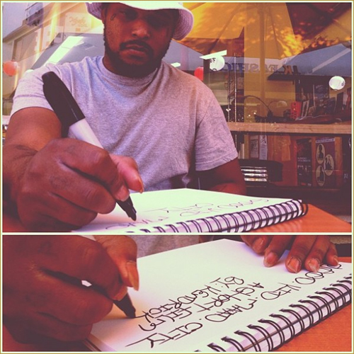
Word to Mr. West. The font game is an important and oft overlooked part of the rap game and we should all take a moment out of our day to reflect on the use and abuse of typefaces in hip hop. Relax sit back and take notes.
The GOOD:
For some, half the anticipation was for the album covers that would be released prior to the actual songs. Not only would we get to see what dream team (or redeem team) line-ups were in store, but we would also bear witness to the latest installment in one of the most effective hip hop marketing campaigns of all time...OF ALL TIME!!

A marvel in minimalism. Look at dat anti-aliasing...dat rusty red...dat perfect kerning gawd oh gawd.
DONDA definitely made an impact with this one. And whether it's being ripped off by shitty internet rappers or in use by GOOD music themselves, this font has had a more illustrious career than Kreayshawn and will go down in rap design history.
aaand at numero dos we have champagne papi coming through with a valiant effort at reaching the bar GOOD music has set:
This smooth and subtle buttery ass font was perfect for the music he was making at the time and it hearkens back to the cover of drizzy's game-changing so far gone mixtape. He didnt really stay as consistent with his design choices as the GOOD team did but it was nice while it lasted.
Also I may have ripped him off for the title of this blog but i'm working on some new shit so chilll.
But how much more #teambreezy blood must stain my nike wide reciever gloves before you stop the madness??!?? You cant do this to me bruh you gotta stop. Please. drizzy. pls.
This smooth and subtle buttery ass font was perfect for the music he was making at the time and it hearkens back to the cover of drizzy's game-changing so far gone mixtape. He didnt really stay as consistent with his design choices as the GOOD team did but it was nice while it lasted.
Also I may have ripped him off for the title of this blog but i'm working on some new shit so chilll.
The Bad:
And speaking of my main man Mr. OVOXO...I came across this picture last year and was stunned. Aubrey...AUBREY, now this may be a premature complaint..but if this man's shirt gives any clue as to what is in store fontwise for OVO '13 then I don't wanna see it. According to dafont.com this medieval fairy shit is called Preciosa...fam...Preciosa. Aubrey. Aubs. You know I can't keep doing this man. I can't keep defending you forever you know that right? You make it too goddam easy for them bruh. I had your back with the sweaters and your many sartorial misadventures, i supported you with the experience showers, I stood up for you during the blackberry freestyle fiasco, the duckface photo era I lived through that man...
But how much more #teambreezy blood must stain my nike wide reciever gloves before you stop the madness??!?? You cant do this to me bruh you gotta stop. Please. drizzy. pls.
Forreal though it's not a great font buuut I can respect Drake for pushing the font boundaries of the game so go head switch your style up.
The Ugly:
Preface: Just so yall know this is a 100% REAL OFFICIAL cover released by T.I. for his freestyle over Clique...

...
uhhh..
...
Words truly can not do this jpeg justice.
But here's a couple...
So T.I. man, first off...is this a chalkboard?? I would say yes but I've never really seen black writing on a chalkboard before and I don't want to jump to conclusions here...
But ooooooh there's a piece of chalk conveniently floating in the fraaame okay thanks T.I. for the inclusion of that I guess that clears things up. This is indeed a chalkboard.
And ummm just to clarify, is that piece of chalk glued to the board? Or is it falling down? Or is this a top down image of a chalkboard laying on the ground?? Are the physics of this cover supposed to be this confusing? Is this all part of the marketing plan?
And what are we to make of the pairing of the black text with white chalk? Am I missing some sort of sharp social commentary?? Tell us T.I... the world needs to know.
I also appreciate the usage of Comic Sans here. It totally looks exactly like someone actually wrote something on a chalkboard and totally didnt just half-assedly use the first handwriting-like font they saw when they scrolled down the font list on MS Word. Good stuff T.I. gooooood stuff.
Really though who authorized this? How high was the grand hustle team when they decided to release this?? And whose Microsoft Paint talents went into the making of this travesty? This is worse than when Luda photoshopped nike mcfly's onto his feet. I mean, you really gotta try to make something this bad though. T.I. I hope you fire your creative team. And if YOU made it then I'm happy you didnt pay anything but please next time, ask your kids cus they probably got powerpoint default template slides that look better than this shit....and please..anything but comic sans man.
Well, I hope I have shown today that fonts are important. Because everyone judges books by their covers...that's why we have covers. So please put some thought into your design choices ppl. Your fonts can say a lot about you...
Stay true to your selfs.
Love,
Sosa


#champagnepapyrus
ReplyDeleteWide receiver gloves eh? In the same closet as your all your nets jerseys?
that was not a very inclusive joke...i apologize
ReplyDeleteRAP GAME NARNIA.
ReplyDelete